Stage 2 Research

  1. ‘Conspiracy Theory: Did We Land On The Moon?’

So far I’ve been heavily influenced by introduction clips for films and TV shows, as i’m working on an intro to a television show to do with the conspiracy theory surrounding the moon landing I thought it was appropriate to research into these type of intro’s that show parts or give an insight on what the show will be about. Notable ones include the documentary series, ‘Conspiracy Theory: Did We Land On The Moon’, the introduction to this episode inspires me to use found footage of the Apollo program to show evidence on how the landing were faked (through a non-believers point of view).

hqdefault

I also find the over exaggerated nature of the American documentary series very entertaining and how every little detail is up in your face, not letting you acknowledge anything that’s going on in the intro. The director, John Moffet seems to be a very strong conspiracy believer looking at other work he has done. Unfortunately, none of his other work is relevant to my project but I will 100% be taking the extreme editing into consideration when putting together my piece.

2. ‘True Detective’

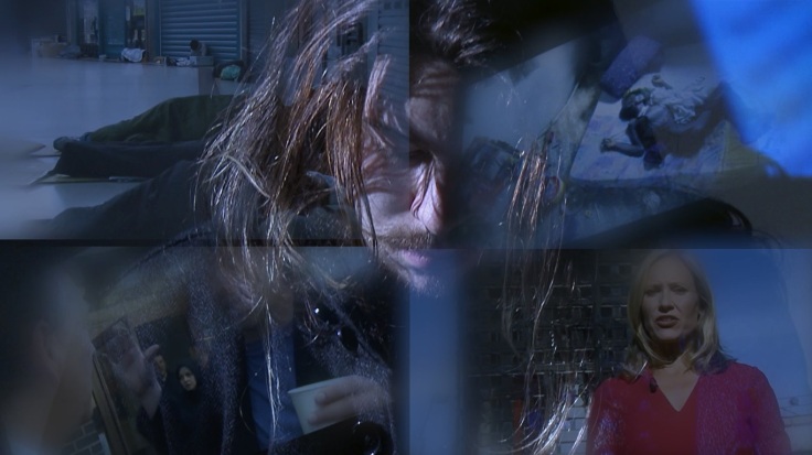
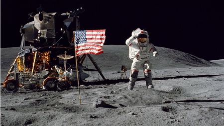
When researching for the ‘Different Point of View’ brief my main inspiration came from the introduction to ‘True Detective’, which is an American anthology crime drama. Even though the show has nothing to do with my idea of a moon landing conspiracy documentary intro. I instantly fell in love with this film sequence as soon as I saw the potential for the use of double exposure in my moon conspiracy intro film. I really believe I could show the different point of view of what people believe happened during the Apollo missions, for example showing the infamous flapping flag on the moon in one shot, and then showing no sign of a blast crater under the ‘Eagle’ spaceship.

Untitled

Audio is another factor I need to consider when creating my piece of cinematography, seeing as its a trailer/intro it’ll need either music or narration. I especially liked the dark-country Western music that played in the ‘True Detective’ intro, but with the type of video I’m going with this gloomy, depressing music might not work too well.

Replicating some of these effects will be near impossible for me to do, but luckily with the use of Adobe After Effects and Premier Pro I may be able to make somethings similar.
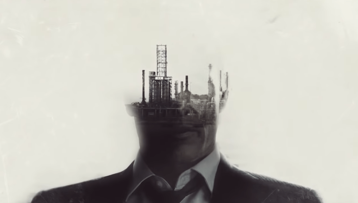
Screen Shot 2019-02-11 at 14.30.07.png


3. ‘World War Z’

Delving deeper into video manipulation I came across this opening scene/intro for the popular zombie film, ‘World War Z’. Having seen the film the introduction is way more cinematographic and much more artistic. Though there isn’t double exposure at any point during this sequence, most of the footage is not original content produced by the director, but is taken from news shows and television programmes. Seeing as I’m doing my idea on the moon landing and raw footage I will find it difficult to create original content so finding this video is a breath of fresh air now that I know I can comfortably use raw footage from the moon missions.

wwz-e1549901622813.jpg

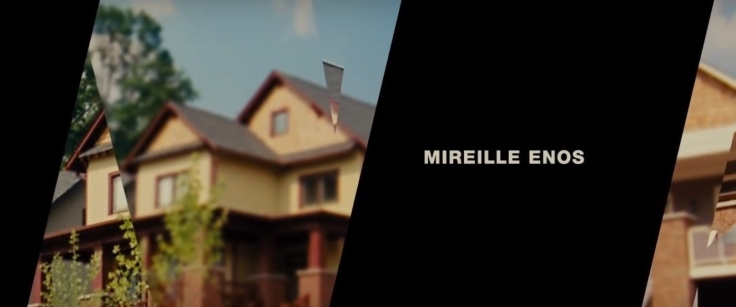
From what I’ve created so far I believe this piece of content will be my main inspiration due to the fact that some double exposure techniques I have talked about seem to be a lot more difficult to make than I thought. Saying this, I will still be creating simple double exposure effects to en extent. As seen in the image above there is a use of black masking, and also blurred masking, where there’s an enlarged and shifted copy of the footage underneath the original. I will try replicating this technique in my future work. The masks also move and morph in every scene, here’s the intro on YouTube to get a grasp of what I mean.


Having watched this video over a dozen times it’s going to be difficult not to copy some aspects, for example the pacing and the similarities in music. I will hopefully be creating a hybrid video that includes aspects from the ‘True Detective’ intro and this video above.

Photography, Moving Image and Digital Media

During the first couple of weeks of stage 2 we started on our visual communication rota where we learnt the more advanced principles of visual communication, for example the use of aperture in photography, animation with moving image and 3D modelling in digital media.

Photography

So far we during our Monday sessions we’ve had individual tutorial days/discussions with our tutors and also half a day of photography tutorial where we have extended on our photography knowledge. I have found that the class discussions we’ve been having on these Mondays most useful due to the input from not only the tutors, but class mates as well. Also during these sessions we were shown multiple videos including the one below, which has inspired me a considerable amount during my project.


Moving Image

We started by creating animatics on Adobe Premier Pro by quickly story boarding a small story then going out to take the still shots. Here are the photos in order from the animatic ‘Bad Hair day’:

This slideshow requires JavaScript.

Without really considering it before, I will 100% be doing animatics as a part of any moving image piece I will do in the future, as it helps with timing and framing your shots pre-filming.

We later moved onto learning how to control a film camera, and we were split into 2 different groups to produce as much film as we could so we could all independently edit them in the future lessons, here’s a snapshot from the video:

Phone sequence screenshot.jpg

The idea of overlaying the video of the news stories across Ewan’s face came from the workshop exercise we did when we played an already video that we made through a projector onto his face. The message was clear; how some are blinding themselves from the outside world with their phones.

Next was animation, I was actually pleasantly surprised by this workshop session even though my pathway is mainly film, we were taught on keyframes, basic animation in two’s (2 shots of the same frame to make 24fps), and we began to make basic morphing animation where we made a simple 2D circle morph into a 2D square. We then chose what 2 opposites we were going to morph into one another and I decided to literally turn the word ‘chaos’ into ‘order’, here are a few screenshots:

I will definitely be using this type of animation to make a few short clips for my stage 2 brief.

Digital Media

We began our first lessons by brainstorming and getting our ideas down on paper, through writing a 100 iteration piece on our topic, which I found very useful and will be doing this type of brainstorming in the future with new ideas. We looked through a series of D&AD books which I’m confident inspired us all.

We made simple laser cut ring pieces before Christmas break that we had developed on Adobe Illustrator, here’s an example of what we made:

Laser cut

In the next lesson we took our Illustrator skills and began using a 3D software called Blender, I found these workshops particularly difficult in some areas, especially getting used to the odd 3D modelling softwares. We then put them online for people to view on teh website Sketchfab. Here’s a still 2D image of the 3D scape:

Artboard 1

Each different shade of grey is far away from each other in comparison to the front image with the two silhouettes.

Overall in our digital media workshops we learnt about how to use Adobe Illustrator properly through learning how to manually trace, live paint and give objects a fake 3D look. Here are some examples of that work:

IL 3D illustrator


Major Project (Stage 3): Initial Ideas

Idea 1: The Consequences of Climate Change

Genres: Film, Interactive Film, Game Art/Design, Experimental Film

Practitioners: I will be researching into Black Mirror: Bandersnatch to understand how vast a multiple choice film could be.

Also a series of videos the Royal National Lifeboat Institution created to inform and educate people on how to save a life. ‘RNLI: What would you do?’

Lastly, ”Choices’ – An Interactive Short Film” which I will also be looking at.

Ideas: Making a multiple choice video/game online on YouTube or through DVD [so that the viewers can choose easier] but also tricking the viewers by making them answer questions that don’t matter, like what cereal you eat that day.

Techniques: Learning how to program a DVD or code multiple choices into a video.


sf-conspiracy

Idea 2: Carry on my documentary on the moon landing

Genres: Film, Experimental Film

Practitioners: I will be looking back at some videos and documentaries that I researched in stage 2, and one of them will be ‘Conspiracy Theory: Did We Land on the Moon’.

Also some past programmes like ‘The Mythbusters: Was the Moonlanding Faked?’

Lastly for my second idea I will be looking at other sort of specifically, experimental and more documentary film making.

Ideas: To create a documentary on the moon landing, but with a twist; it tries convincing viewers to believe that the moon landing DIDNT happen, and making the believers look stupid.

Techniques: Over-the top video editing techniques like most American documentaries are like.


In later posts I will decide out of my ideas on which I will carry on to do in the next 10 weeks.

‘Another Point of View’ (Stage 2)

A first look/initial ideas

When we were given the ‘Another point of view’ brief on the 10th of December it seemed very unclear on what was needed to be done, and how we were going to do it through visual communication. Initially we all thought it was from the literal different point of view, for example the point of view from a horse when it’s about to be shot by its owner, like happens often. Turns out it’s more of an empathetic understanding of someone else’ point of view, e.g. people who believe we didn’t go to the moon. I had 3 main ideas, which was:

  1. The perception of death through different religions
  2. The perception of the real world/work through the eyes of school dropouts
  3. The perception of various conspiracy theories through non-believers eyes
  4. Media corruption and how it is seen as acceptable by some

Image result for dropouts vs graduates: is college worth it

In later posts I will decide which one I will pick by researching deeper into each individual topic. Some early inspiration came from a YouTube channel that gets people together who have opposing beliefs and then they attempt to come to a middle ground in their beliefs.


Stage 1 Research

Tripoli Cancelled (2017) – Naeem Mohaiemen

Seeing this film for the first time in Tate Britain I felt instantly inspired by the still shots and use of colour. While making my ‘This is Not a Video’ video (which will be released shortly) I considered the stillness of my shots and also the use of colour in them, where in the boring shots I used a black and white colour pallet to make the shot miserable and then also when an exciting scene surfaces I’ve saturated and made the film look much more vibrant, like in the scenes from Tripoli Cancelled where the orange sunset contrasts with blue shadows.


Moon Jar – Adam Buick

adam-buick-moon-jars

Straight away after seeing Adam Buick’s work in the ceramics workshops I was instantly inspired to make something similar. And typically before I knew the name of this project I thought they looked like moons. So that’s what I did; I created 4 Jovian moons for my stop motion: ‘A Galilean Adventure’. I was particularly inspired to make Jupiters moon, Europa, that has the same sort of cracked pattern and colour as Adam’s work.


Ceramics, Sculpture and Digital Media – Rota 2

After completing the first 3 weeks of our academic year we began on our second rota, which consisted of ceramics, sculpture and digital media studies. We still had tutorials on Mondays, ceramics on Tuesdays (and one more ceramic lesson after the Halloween reading week), sculpture on Wednesdays and then contextual studies on the Friday.

Now that our Tuesday self directed studies where now switched to ceramics, I had to manage my time more effectively now that I will miss 5 hours of project work, saying this I much rather have a discipline based day than a self directed one. I found it to be more advantageous in the sense that I have now got more of an understanding of ceramic based work and also now I have more of an artistic mind and portfolio.

Ceramics

Instantly from the first day when watching the power point our ceramics teacher showed us some of Adam Buick’s ceramic work to us, and immediately reminded me of planets and moons that are out there in space. Particularly Europa, a moon of Jupiter. I was also inspired to create Europa while I was aimlessly rolling a piece of clay in my hand, this was the outcome:

IMG_0475.JPG
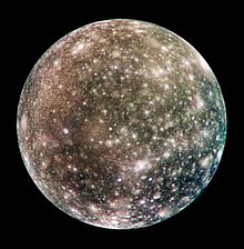
I was very intrigued by the outcome and wanted to explore it more and how the cracks formed. I enjoyed this look because it gives a natural look on how the cracks form, instead of imitating them. Below are some of Adam Buick’s ceramic work and you can clearly see how his work inspired me with the planet – looking patterns on them:
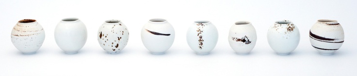
adam-buick-moon-jars

So after sketching and thinking of ideas about what I was going to do I decided to create the moons of Jupiter through ceramics and then to glaze them. After messing around with the clay and also learning on what my boundaries of creating were I soon realized I was not going to have enough time to create 4 separate sized moons in the 3 days of ceramics that I we had. So instead I would create one out of ceramics, one out of plaster, and two out of paper mache. I will then place them on the ground orbiting a ‘fixed’ point, they will all be revolving around at different speeds and distances. I will show this by using stop motion and perhaps give it more life by adding one of my objects to the system, and letting it travel from moon to moon. If I could do something differently it would be to create something expendable to fire and glaze during the first week so I could experiment different colours, glazes, etc. During the second week, I started making my sphere that I decided was going to be Callisto, Jupiters second largest moon.

Callisto

I decided to create this particular moon because I believed the bright craters would be interesting to ‘fix’ onto the surface with some sort of white glaze. I also believed that it would be the most suitable scale seeing a choosing one of the smaller moons would be increasingly difficult to make. I started by creating 2 identical half spheroids that I made with a plaster mold I found. I would then make some slip, which is very ‘pasty’ clay that would help bind the 2 half spheroids together. After making some finishing touches it was ready to be fired so I could start painting next week.

The following week we started off by researching different colour glazes, for example Manganese oxide, which gives a brown/red/blackish look to your work. I though that this compound would be suitable as a base coat due to the brownish hints in the surface of the moon; but I was very wrong. I seemed to underestimate how red it would actually be, and it turned out like this:

IMG_1062[1]

As you can see this looks nothing like what I imagined it would look like, so I will now paint over it in acrylic paint, (which is a risk I’m willing to take) to attempt to make it more realistic looking. To finish my Jovian system for my stop motion video I will now go ahead and create the 2 paper mache moons, and then the single moon in sculpture. Reflecting back at this experience I wish I could have made 4 globes that were different sizes and maybe I could have done that by creating 3 more plaster molds so then I can create 4 solid, ceramic moons. What I would have loved to know more about is how the paint and glaze would actually turn out on my ceramic piece due to this globe being a total flop of a colour.

Sculpture

Looking back at my time in sculpture we basically did the same in the first day as we did in ceramics; which was messing about and learning how to work with plaster and sculpting clay. We sculpted our objects and also vacuum formed some of them, then filling the plastic form with plaster to get an accurate replica of the object.

We were later told in the next week to start constructing a utopian world where we could display our objects and ‘fix’ all the molds together. I decided to create a piece of architecture that could be ‘fixed’ in many different ways to make many different utopian buildings. I used and molded many of my objects to make structures such as this:

I was going for a 1:100 scale futuristic mansion type of building with a ‘hand’ water feature, a ‘connecting rod’ hot tub, and many other details that resemble my objects. I used many sculpting techniques to create this but still believe that I should used ‘Mod Roc’ to maybe secure my sculpture together, but it may have defeated its purpose and restricted the way you can ‘fix’ different parts to it and ‘fix’ it into different shapes.

Digital Media

During our digital media lessons we created many different pieces of art through using Photoshop as seen in the blog featured image above, we started through learning basic controls for the Apple Mac and after we (sort of) got a grasp of that we started working on Wacom tablets to create things such as this:

turtle

It was essentially creating anything from our abandoned objects or any objects we could find really. I enjoyed this due to the fact that I find it interesting how everyday objects can be manipulated into looking like strange and abstract pieces of art. I’ll probably look upon this technique again in the near future by using Photoshop to manipulate an image; as I’m going into the Visual Communication side of things.

Next week we started on using Photoshop a little bit more professionally by learning how to apply text and manipulating it to look how you want. We were also taught on how to add multiple layers and different effects to make very abstract and sometimes messy pictures. Nevertheless I relished in this practice just because I love learning new things when it comes to Photoshop and other digital software.

During the last week we started integrating our phones with Photoshop to help us in our studies. We did this by downloading ‘Adobe Capture’ onto our phones so we could take multiple different images, shapes and patterns like in the image below:colourful rocket.jpg

I enjoyed doing these very orderly images and I like how graphical they look; even though they’re real life objects. The featured image that is used above near the title was also created using the same techniques. I will most definitely be touching upon these processes again in the future seeing as I’m going down the digital media route.

Concluding what I’ve learned in the past 3 weeks during our second rota I would say the most important thing to take away from these disciplines is how important it is to have knowledge in multiple aspects of art and how its always important to have more of an understanding so the different aspects of art can aid other aspects of art.

London Trip

“When a painter paints a picture it can be immediately abstract. They have no problem making abstractions…When a photographer makes nature abstract, an attempt is made to transform a realistic scene into an abstraction”…

This wise quote from Aaron Siskind is a part of a collection consisting of hundreds of other phrases and famous quotes from when I visited Tate Modern and Tate Britain with the college around the 14th and 15th of October. After a very early start and a near miss with the local floods, we started off from Jobswell campus at 6:30am and began our 4 hour journey into the heart of London. We first went to the Hayward gallery to venture into the world of ‘Space shifters’, which was an exhibition that explores perception and space; we had been discussing about ‘space’ and ‘place’ in our Friday lessons in the college so this particular installation was a brilliant decision to attend.

IMG_3633Everything in the Hayward gallery was so unbelievably abstract and taught me that art has literally no limit (I felt like this when entering Richard Wilsons oil room installation). After queuing up for an hour each person had the chance to enter this room filled the strong scent of engine oil (and also filled with the fear of falling off an imaginary edge.)

After rushing back to the bus we made it to the enormous Tate Modern where we were split into two groups to enter the ‘Shape of Light’ exhibition where I stumbled across 2 artists that their work I adored. Aaron Siskind (his quote at the top of the blog) and John Divola are two phenomenal black and white artists/photographers that cross the line between reality and abstraction.

Between 1974 and 1975, the American photographer John Divola travelled across Los Angeles in search of dilapidated properties in which to make photographs. Armed with a camera, spray paint, string and cardboard, the artist would produce one of his most significant photographic projects entitled Vandalism.

I’d certainly say that Divola’s use of string and patterns using spray paint place his images further down the surrealism scale than maybe Aaron Siskinds texture images. I have to admit that observing these pieces for the first time was actually as I believe he manipulates the depth of field in these images with the use of the objects and also location of the camera. John Divola has definitely considered the use of space in these images and has taught me that even photographs can be as abstract as you want them to be. I will try to achieve this ‘loss’ of spacial awareness as much as I can in my future work.

The second artist I would like to explore is Aaron Siskind who frequently uses close-ups of different surfaces one would normally see everyday, thi technique causes a very abstract look to the photographs due to the surreal textures that have been zoomed into. Below are some examples of a road marking and remains of a poster on a brick wall.

I would assume that if this were to be done in colour, it would not have nearly the same effect due to the viewer being able to recognize what they are looking at, and not paying as much attention to the beautiful textures that are displayed. After observing Siskinds work I have now learnt that photography can be used for more than just to capture a 3D moment in a place and a time, but also a 2D close-up that leans more towards the fine art side of things.

Last and certainly not least is Naeem Mohaiemen, a Bangladeshi filmmaker and writer who would frequently use installations, essays and film to research South Asia’s postcolonial markers. But what I’m more interested in is his experimental feature-length film, that was shown in the Tate Britain gallery as a part of the Turner Prize 2018. This 1 hour 35 min film has a maximum of 1 page of dialogue and is one, in my opinion, of the most unique and experimental uses of film I’ve seen; also the most beautifully shot.

The images above don’t come close to capturing the beauty of this experimental film, you just HAVE to see it. I really came to appreciate the silence in this film and definitely the stillness of the shot – it made the main character feel even more alone than he actually was. I will be taking so many tips and tricks from Naeem’s film and how dialogue doesn’t always matter. But the main thing will be the different kinds of camera shots he used in the film, that can’t be seen in the images above.

Overall I really enjoyed the London trip and I was very glad to see more lens based media type of work in all the exhibitions we visited, along with the design aspect that I also really enjoy when we went to the Design museum.


Painting and Life Drawing – Rota 1

For the first 3 weeks of our academic year we ventured into 2 different disciplines, which was painting and life drawing. We also did 3 days worth of self directed study where we would work on our own projects on the brief, ‘fix’ and do research on artists etc. For the first 3 rotas we would have discipline studies on Tuesday, Wednesday and Thursday and then tutorials every Monday, and lectures in contextual studies every Friday.

The self directed studies on Tuesdays consisted of basically what it says; a day of self taught/directed studies where we would work on our project/assignment ‘fix’. Going into our second rota now, we won’t get the day of self directed studies, so I will now have to manage my time even better now that I will be losing a whole 5 hours of project work.

Painting

Painting was an interesting one for me, as I hadn’t done any sort of painting for years. Nevertheless, I took much from it by working with primary, secondary, complementary and many other shades/tones/hues of colours. I found mixing colours and keeping them tidy on my palette very hard at first, seeing as I am a profound perfectionist. But by the end of the 3 weeks I learnt to ‘let go.’ Here’s some of the colour fades we worked on on the first day of painting. IMG_9997

Warm colours: Fading through red, orage and yellow

Colour Contrast: Fading from blue to orange

Tonal: Using grey to fade to a colour (Blue)

Shade: Using black to fade to a colour (Blue)

Tint: Using White to fade to a colour (Blue)


By doing this exercise and also making a 12 colour colour wheel I learnt about primary, secondary and tertiary colours, which all lie on the colour wheel. I also learnt how to (roughly) mix colours on a palette, but I think the main thing I will be taking fro this will be how to correctly use colour in my future work. We later moved on to creating our first paintings by placing our objects on a table, here are the results:

img_7536.jpg

img_7535.jpg

We kept at roughly the same tonal range of the colours as seen, and also adding some delicate and light colours aswel. I felt like I didn’t use much water at all in these paintings, which was a mistake that a later did again and again, until finally stop being a perfectionist and using a water to paint with.

Going into the second week we started concentrating on panting on different scales, and also with contrasting colours, as seen below:

IMG_7469

I decided that I would directly print my objects onto the wet paint so it would give me a realistic scale to my objects. I also used watered down white paint to give one of the paintings a certain look (Top row, third column).


After making these small painting we started working on a piece with our objects again. Here are those results:

img_7471.jpg

I used all the colour schemes that I used in my 12 pictures above and merged them into one, I guess you can say ‘fixed’ them into one. I also used white wash to whiten down the picture.


For the last week of painting we went straight into working on A1 paper without making any colour samples or anything like that. Working mainly with the tint of a colour and finally, washed down paints with water. Here are the three paintings I made throughout the day:


I enjoyed creating the first image of the connecting rod because of the way I’ve displayed almost all angles of the object in an abstract sort of way. I also think this image is better than any other painting I created during the first rota because it isn’t completely drowned in paint, it has a black gap between each colour and tone of paint. Also I finally used water with my whites which gave a more fluid look to my piece. I will most definitely be using this technique when I paint for my assignment again.

In this next picture, me and my partner combined objects into one display, to create 2 different paintings from 2 different angles. Like the last, we kept with the same colour (purple) and added different levels of white paint to it to create different levels of depth and shadow to it, and I also believe this is one of my best.

Last but not least, is my negative shape painting I created in a limited amount of time with watered down paint with a tiny blob of purple paint to give it a soft hue. I decided (after a paint drip rolled down the page) to add more water streaks to give it a more abstract look.

Life Drawing

Moving onto life drawing I really enjoyed the first week of it where we created 31 drawings of a model in only a single day, here are some:

Life drawings 1Life drawings 2Life drawings 3

We worked on many different techniques when making these, such as normal and timed drawings, manic marks/harsh lines/dots, highlighted highlights (basically only drawing around the highlighted areas), ink and a rolled up paper towel, and finally using the tools we created in broad haven to create images. We actually ‘fixed’ charcoal to our tools to make double marks with ink and charcoal. I thoroughly enjoy timed drawings as I find it can cause me to create very unique and abstract drawings. I also find if I am given more time to draw I tend to over-analyse and overdo the drawings. I found drawing with ink excruciating because I find it unreliable and awkward to draw certain things with. Saying this I will be sure to use my mark making tool and ‘fix’ it with some charcoal so I can then create interesting patterns and drawings.

As we went into the next week we started drawing with pastilles where we used the primary colours and used them as different levels of shade instead of using just charcoal. So, we used blues as the shadows, red as the mid tones and yellows as the highlights. Here are the pictures we drew of the model:


This personally was a technique that I would even have considered before starting the course but looking at some of the results I will definitely be revisiting this use of colour in my future practice as it is very visually appealing mostly because the use of the primary colours.

Moving on to the last workshop day of the final week, we started drawing with ink which I found very interesting but also very difficult and an inconsistent substance to draw with, I personally didn’t enjoy this practice as much as the others, but when I let go near the end of the collection of drawings we made that day, I discovered that I could make fascinating pieces with it while also using water to bleed out some of the ink, here are some examples:


Most of these photos in this blog are in order from left to right, same with this particular set, but then having one of my final pieces of the day being on the right and being larger than the others. Anyway during the last day we used blue and brown ink, (brown being the highlights and blue being shadows) to create life drawings of a now clothed model, which was much harder due to the fact of the clothes having many unique shadows and curves, in comparison with the naked human body.

I began using much more water with the ink towards the end in comparison to the beginning of the day (see above), and after doing this I found more beauty in using ink to draw with. I particularly enjoy using the white of the paper for the highlights with these ink drawings and will probably venture back into this technique in the future, even though I would prefer to go back into the other techniques from other classes.

In conclusion, I feel as if I have become more open minded in how I draw and create my art pieces and will now apply this knowledge into my future studies, instead of just using the basic mark making tools that I used to do.

Induction Fortnight

Induction Fortnight & Broad Haven

During these first 2 weeks of college, we started on the task of making a ‘cardboard world’ as a whole group which consisted of each student collecting as much cardboard we could find and then placing mismatched sheets of it all over the gallery wall. Prior to this, we had half a day drawing with charcoal and experimenting with many different drawing techniques, these consisted of: blind drawing, drawing with our unorthodox hand, timed drawing and many more. We drew a series of pictures of objects we were asked to bring in, that meant a lot to us/from our childhood and after completing many drawings we were split into two groups, where we would decide on how our ‘cardboard world’ would look, while also keeping an eye on the other group.

After placing and sort of securing the cardboard with duct tape, we started drawing our decided piece onto the walls and with much difficulty keeping the load fixed to the gallery walls it came out like this:

IMG_9728[1]

*what we didn’t know is how the duct tape would give in at some point between Friday and Wednesday*

Broad Haven

After a long lie-in on Monday morning, we set off for a 1 night stay in Broad Haven where during the 2 days there, we explored upon the study of crafting and sculpting, while also reverting back to the techniques used at the start of the two weeks, except this time we were drawing in a small book on a windy cliff edge. Throughout the coastal path walk on Monday, we touched upon continuous line drawing, blind drawing (but with one hand on the object to feel textures), harsh streaks and dots and many more as we walked 2 miles along the beautiful Pembrokeshire coast. I particularly enjoyed what came out of my blind drawing exercise, where we would not only be unaware on what’s going on in the sketchbook but also we would be walking at the same time, and kinda be letting our hand do its thing while trying to sketch as much information down on what we saw as possible. I am not particularly good at drawing but here’s what came out of the blind sketch I did.

img_e00081.jpg Many of my fellow students and I noticed even though the drawing was blind they could see people to the left and the footpath, and (maybe not as obvious) a hedge and gate to the right side. I do believe that I should embrace this style of abstract drawings and I will use the techniques that I learnt in the induction fortnight in my future work.

The next day (after a few pints), we were told to go and spend a few hours collecting discarded and abandoned objects from the coastline. We later returned with our lost pieces of string, rocks and other objects and started arranging them in colour order, like in the picture below.

After photographing this we began sculpting tools to draw and generally make a mess on a very long roll of paper, as seen below.

Many unique tools were made and I decided to form a roller (that didn’t work well at all), saying this I won a breakfast bar for innovation that I treasure to this day.

Second Week

We soon found out what happened to our cardboard world installation as we walked into the gallery and saw 50% of the cardboard on the floor. Nevertheless we started working on our next mini project where we were told to design and sculpt a piece of wearable ‘installation’ sort of thing, a bit like a piece of clothing made from cardboard. These were the blueprints for me and my partners ‘steampunk’ suit.

Everyone later walked along a fake catwalk with their ‘outfits’ on and 2 cameras (with me operating one) and filmed everyone posing with their unique suits on. In the next couple of days we began introducing 3D sculptures into our cardboard world. Prior to this we were placed into 6 different groups and began researching artists to take inspiration from, and them implemented that knowledge into 6 different instalments. Here’s ours:

Unfortunately, everyone was told to ‘perform’ in their groups by using the installation as a part of that performance, we only planned on what we were doing roughly 30 seconds before it was our turn, we didn’t enjoy. Our plan was to rummage through the leaves and paper hair of the 3D sculpture, brilliant I know.

After some lectures on the last day we began deconstructing the whole gallery until it was a completely empty space. In summary it was a very eye opening and eventful experience and I enjoyed it very much.

Blog at WordPress.com.

Up ↑

Design a site like this with WordPress.com
Get started